THE HEART OF OUR HOME
Client: A Publishing Company/ Home Chefs
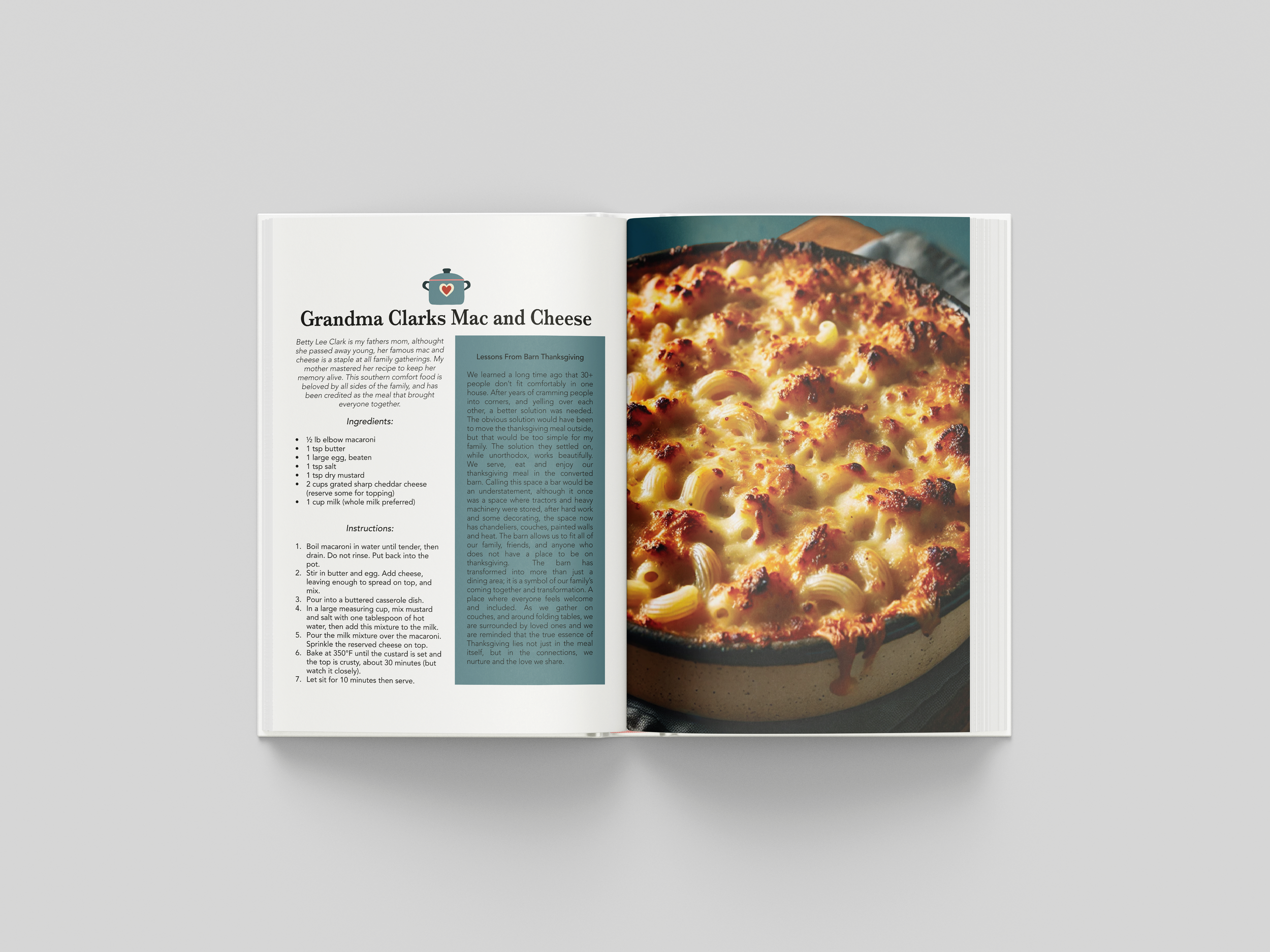
Goal: I wanted to create a visually inviting, user-friendly cookbook that highlighted the cultural diversity and nostalgia of my family’s recipes. I wanted each page to feel warm and homey, capturing the essence of my family traditions through a combination of colorful visuals, up-close pictures, and exciting copy.
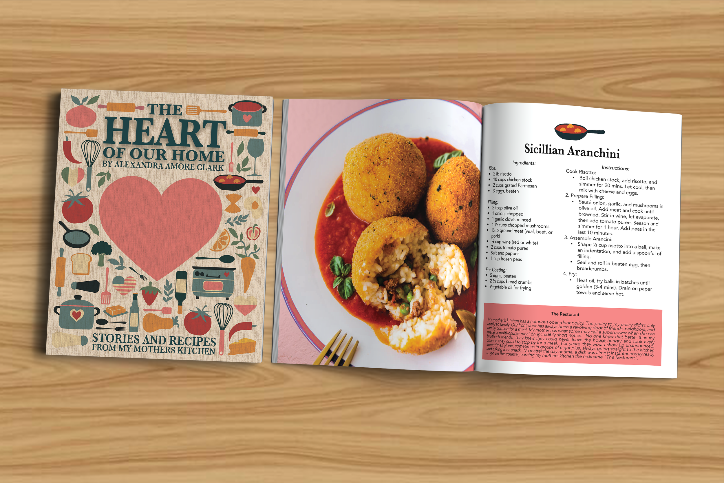
Approach: To bring the cookbook to life, I chose a warm and cozy color palette of elevated earth tones, drawing inspiration from foods and the fall season. The book features many icons of the ingredients, adding visual cues to the recipes. I used AI to create pictures of foods and to aid in translating some of the recipes. The recipes themselves came from my mother’s and grandmother’s recipe cards. The cover balances flat blocks of color with a linen texture to add depth and a sense of luxury to the book.
Result: The final cookbook is a visually cohesive, heartfelt collection of recipes, stories, images, and graphics. It is easy to read and follow while being visually appealing to readers.